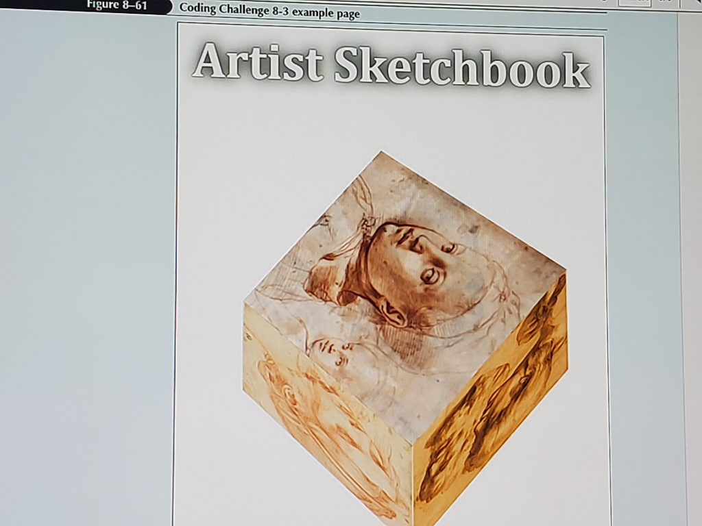
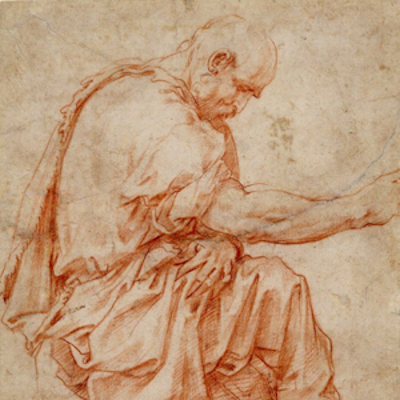
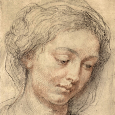
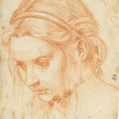
Animation can be used with 3D objects to create the illusion ofobjects moving and spinning in 3D space. Figure 8–61 shows theopening page of the Artist Sketchbook web page in which sixdrawings from Renaissance masters have been combined in a 3D cube.You will use CSS animation to spin the cube, showing all faces ofthe cube during the animation.
Do the following:
1. Open the code8-3_txt.html and code8-3_anim_txt.css files fromthe html08 c code3 folder. Enter your name and the date in eachdocument and save the files as code8-3.html and code8-3_anim.cssrespectively.
2. Go to the code8-3.html file in your editor. Within the headsection insert a link element that links the page to thecode8-3_anim.css style sheet file. Take some time to review thecontents of the file and then save your changes.
3. Go to the code8-3_anim.css file in your editor. Severalkeyframe animations have already been created for you. Add akeyframe animation named spinCube that contains the followingframes: a. At 0% apply the transform property with the rotateX()function set to 24deg and the rotateY() function set to 40deg b. At50% change the value of the rotateX() function to 204deg and therotateY() function to 220deg c. At 100%, change the value of therotateX() function to 384 and the rotateY() function to 400deg
4. When the page is initially opened you want it to displayanimation of the six faces of the cube being assembled. Create astyle rule that applies the moveFront keyframe animation to the#faceFront object. Set the duration of the animation to 3 secondsand set the animationfill-mode property to forwards.
5. Repeat Step 4 for the #faceBack, #faceBottom, #faceLeft,#faceTop, and #faceRight objects using the moveBack, moveBottom,moveLeft, moveTop, and moveRight animations.
6. After the cube is assembled you want it to rotate. Create astyle rule that applies the spinCube animation to the #cube object,running the animation over a 3-second duration after a delay of 3seconds. Use the linear timing function and have the animation loopwithout ending.
7. Save your changes to the file.
8. Open the code8-3.html file in your browser. Verify that inthe first 3 seconds the cube is assembled by moving the six facesinto position and that after 3 seconds, the cube begins spinning toshow all the faces of the cube.
HMTL
<!doctype html>
<html lang="en">
<head>
<!--
New Perspectives on HTML5 and CSS3, 8th Edition
Tutorial 8
Coding Challenge 3
Filename: code8-3.html
-->
<meta charset="utf-8">
<title>Coding Challenge 8-3</title>
<link href="code8-3_styles.css" rel="stylesheet"/>
</head>
<body>
<h1>Artist Sketchbook</h1>
<div id="cube">
<img id="faceFront"src="image01.png" alt="" />
<img id="faceBack"src="image02.png" alt="" />
<img id="faceBottom"src="image03.png" alt="" />
<img id="faceLeft"src="image04.png" alt="" />
<img id="faceTop"src="image05.png" alt="" />
<img id="faceRight"src="image06.png" alt="" />
</div>
</body>
</html>
anim.css
@charset "utf-8";
/*
New Perspectives on HTML5 and CSS3, 8th Edition
Tutorial 8
Coding Challenge 3
Author: coding challenge 3
Date: 3/1/2022
Filename: code8-3_anim.css
*/
div#cube {
position: absolute;
top: 300px;
left: 350px;
width: 300px;
height: 300px;
perspective: 2000px;
transform: rotateX(24deg) rotateY(40deg);
transform-style: preserve-3d;
}
div#cube img {
display: block;
width: 300px;
height: 300px;
position: absolute;
top: 0px;
left: 0px;
}
@keyframes moveFront {
0% {transform: translate3d(0px, 0px, 0px);}
100% {transform: translate3d(0px, 0px,150px);}
}
@keyframes moveBack {
0% {transform: rotateY(0deg) translate3d(0px, 0px,0px)}
100% {transform: rotateY(180deg) translate3d(0px, 0px,150px);}
}
@keyframes moveBottom {
0% {transform: rotateX(0deg) translate3d(0px, 0px,0px);}
100% {transform: rotateX(-90deg) translate3d(0px, 0px,150px);}
}
@keyframes moveLeft {
0% {transform: rotateY(0deg) translate3d(0px, 0px,0px); }
100% {transform: rotateY(-90deg) translate3d(0px, 0px,150px);}
}
@keyframes moveRight {
0% {rotateY(0deg) translate3d(0px, 0px, 0px);}
100% {transform: rotateY(90deg) translate3d(0px, 0px,150px);}
}
@keyframes moveTop {
0% {transform: rotateX(0deg) translate3d(0px, 0px,0px);}
100% {transform: rotateX(90deg) translate3d(0px, 0px,150px);}
}
styles.css
@charset "utf-8";
/*
New Perspectives on HTML5 and CSS3, 8th Edition
Tutorial 8
Coding Challenge 3
Filename: code8-3_styles.css
*/
html {
background-color: white;
}
body {
width: 960px;
padding: 20px;
margin: 3px auto;
background-color: white;
position: relative;
}
h1 {
font-family: Cambria, "Hoefler Text", "LiberationSerif", Times, "Times New Roman", "serif";
color: white;
text-shadow: 0px 0px 2px black, 0px 0px 20pxblack;
font-size: 4em;
text-align: center;
}